Recently while I was catching up with an old friend from school I re-broached the topic of how my productivity has been completely shot lately and he empathised with me. We found ourselves discussing how the pandemic has devastated our routines. Later he told me about how he too was also going through something similar as I was.
We seemed to have had similar journeys in our quest to regain control over our time. He too tumbled down the YouTube productivity rabbit hole and tried various habit trackers to seize back control of his life. Only to encounter the same issues with all of them that I did. Having tried a handful of what the market had to offer he was tired, disappointed and pissed. Later he shared how he wanted to create a habit tracker for himself, one that he would like to use.
No way! Coincidence?
There are no Coincidences
I immediately told him about my plans of creating a web-based habit tracker called Sisyphus. He loved the premise and shared his idea of an ideal productivity app as well. We talked for a great while over a few more rounds of beers about what our habit trackers would look like and function. What would the artwork and theme be? Which features would be the most useful? How could we enable users to check on their progress and their friends? And most importantly what about it would make us want to use it? Having stumbled onto the same pet project with similar struggles in life we decided to join forces. After all, two heads are better than one. Not to mention we did share a single brain cell throughout all of 11 and 12th grade.
It truly is a wonderful thing when creative people come together. More so, when they’re ignorant.
by moi.
So we decided to work on this together.
Last time I ranted about the issues I faced when using Google Calendars goals and came up with the idea of a fun web project of my own. You can read more about it here. Anyways the gist was to create my own habit tracker to help me practise my web development skills and build something that I would use out into the world.
Allow me to walk you through my idea for the artwork and functionality of Sisyphus below.
Sisyphus – Form
As mentioned in my earlier post Sisyphus is inspired and named after “the myth of Sisyphus”, a book by Albert Camus. Sisyphus being a character in Homer’s Iliad and other works of Greek Mythology it only seemed right to have a Greek theme and artwork for the tracker. Easier said than done. Ancient Greece is nothing but art. We can’t just use any artwork from ancient Greece though it has to be something that was easily recognisable as Greek in origin but not too grandiose. Something like Hercules slaying the Neymar lion but minus the heroic bravery? Artwork from something that the people of Ancient Greece used every day.
What did they use every day? For the ancient Greeks, vases were mostly functional objects. They were extensively used and admired. They used ceramic vessels in every aspect of their daily lives: for storage, carrying, mixing, serving, and drinking, and as cosmetic and perfume containers. These vases would be decorated and painted over with animals and geometric shapes. However, the most famous designs were those with black figures displaying human and mythological activities. These figural scenes can vary widely, from daily life events (e.g., Fetching water at the fountain house) to heroic deeds and Homeric tales (e.g., Theseus and the bull, Odysseus and the Sirens), from the world of the gods (e.g., Zeus abducting Ganymede) to theatrical performances and athletic competitions.
Fellow Millennials reading this might already be familiar with the artwork described above through Disney’s 1997 animated film Hercules.
This is the vibe that I want to capture for the tracker. The theme I’d like to recreate. The artwork I want to ape. From the background images and interactive elements to the colour scheme and thematics. Sisyphus Tracker must scream Zero to Hero!
Hmmm. I guess we do try to keep recreating our childhood experiences. Who’d have thunk? Anyway, I’ve added a few images for reference below.
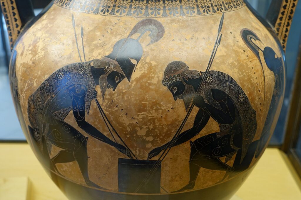
image attribute – Wikimedia Commons
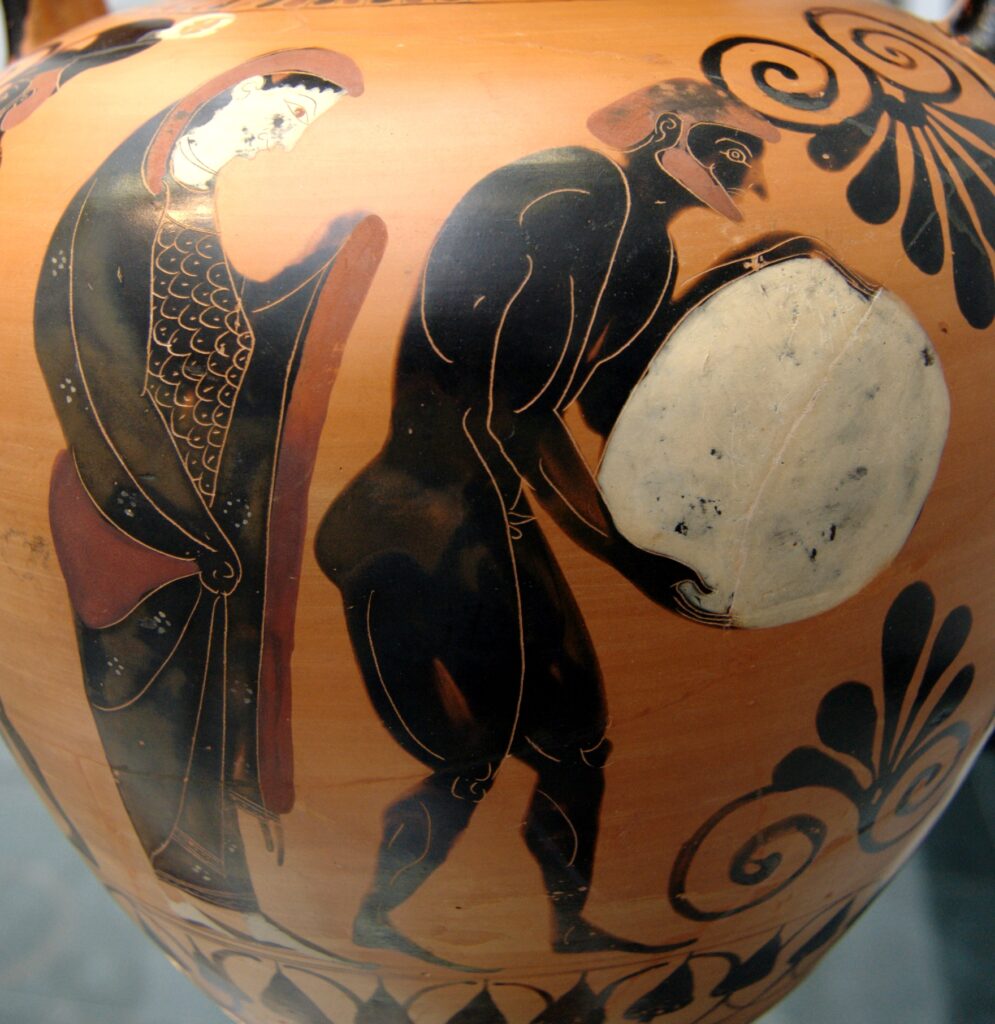
image attribute – Wikimedia Commons
The background colours on default should be similar to the oxidised Vase’s reddish tinge on the original terracotta. That covers what it should look like but how does it work?
Sisyphus – Function
On the opening screen after signing in with their email id and name a user would be able to see their very own Sisyphus standing next to a pebble. The pebble represents the various tasks that the user has to achieve in a day/week. As you add more tasks/habits in the tracker the size of the pebble increases and thus the harder you make it for yourself and Sisyphus to roll it forward. Every task will require a time and a day at which it must be done/begun along with an end date for when you’d like to end the habit/task.
The end date would be symbolically represented as a mountain next to your Sisyphus. The closer the date the harsher the incline and steeper the angle you and Sisyphus have to climb. The further away the end date is lower the angle hence the easier the climb. You must have figured out how it all works by now, huh? You clever little sausage.
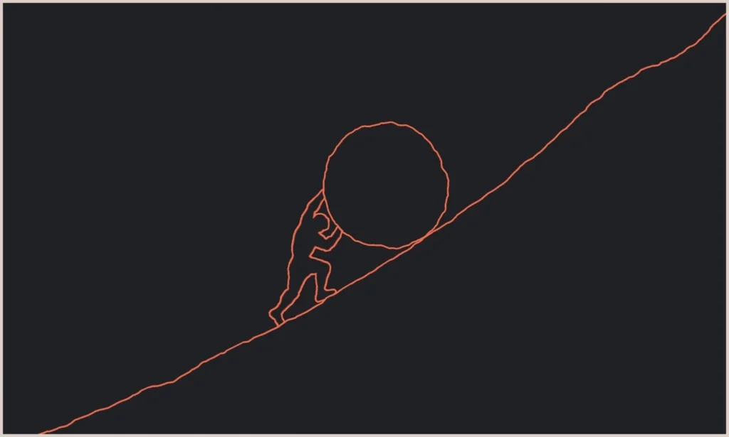

[Add Habits/tasks choose how frequently you’d like to perform them and when. Select an end date. Watch your boulder and mountain size update. Help your Sisyphus conquer his obstacles to spit in the face of the gods.]
We’ll need to add a notification to check whether or not you’ve completed your tasks/habits within the selected time. Every time you get something done within the assigned time Sisyphus rolls the boulder forward a little. And if you don’t then he slips and the boulder rolls backwards.
That’s the basic mechanism and idea.
Now let’s say in a week you don’t get things done consistently and so there’s a nice little backlog of pending tasks and habits. Not to fret any progress is infinitely better than no progress. However, the user should then be able to move those tasks and habits to a later date. To achieve this they’d need to be able to see what their week, month, and year calendar looks like.
This could be accessed by clicking/selecting the mountain. Clicking the mountain brings it front and centre after a brief zoom effect. Maybe we could add some parting clouds to the zoom effect to make it look slightly cooler but no promises. The mountain reveals within it the user’s calendar for the week. And as they scroll out they may see what their calendar for the month, months and finally the year looks like. While the boulder would represent the day’s tasks to be done, the mountain would represent the week’s/year. That covers most things for now. There may be a lot more that I have overlooked. And I’ll address them in other updates. In the famous words of my dear friend “We’ll burn that bridge when we get to it.”